Data Science, Visualization, & Business Intelligence
Data Analysis & Interactive Dashboards
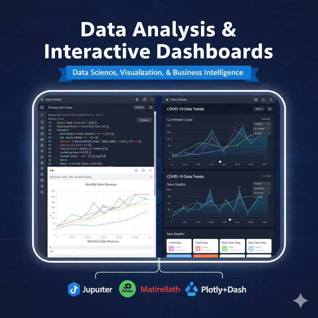
This project covers the end-to-end process of data analysis, from foundational data wrangling in a Jupyter Notebook to building a fully interactive web dashboard. It begins with analyzing a sales dataset using Pandas and creating static charts with Matplotlib/Seaborn. It then advances to developing and deploying a dynamic, web-based dashboard for complex time-series data (like COVID-19 trends) using Plotly and Dash.
Technologies Used
🐍Python
🔧 Pandas
🔧 Matplotlib
🔧 Seaborn
🔧 Plotly
🔧 Dash
🔧 Jupyter Notebook
Project Info
CategoryData Science, Visualization, & Business Intelligence
Technologies7
Features17
Key Features
Entry: Perform data cleaning
wrangling
and exploratory analysis on a sales dataset using Pandas.
Entry: Create static visualizations (bar charts
Code Implementation
Entry: Sales Analysis with Pandas & Matplotlib